
At the time of creating MyKea, the Ikea's app augmented reality function was practically unusable and the app as a whole needed to be revisited.
The Ikea AR furniture view to start with, opens once every 15 or so attempts and thats if your lucky. It was clear that this feature required the most work, not just because of the fact that it didn’t work, but because it had the potential to be a very useful tool to nearly anyone who was decorating their home. After reading reviews online from other Ikea app users who were experiencing similar frustrations with the AR feature, and when we manage to actually open it we realised it was more of a gimmic than a feature. There was very little thought put into the use of the furniture viewer, when you added a couch for example you could expand it and make it as large as you wanted, to what benefit?
With such a blank slate to begin with, MyKea would be allowed to flourish with creativity, within the limits of paper that is.
Our solution was to develop MyKea, the all in one room decoration tool which would be based of some of the existing Ikea AR features. Since technology constraints were not an issue we felt that it gave us the opportunity to let the reigns of our imagination a little bit and come up with something that would be both a great, useful product but also unique and interesting.
With MyKea we felt that it should have something for everyone, it shouldn’t be just a space to test what a piece of furniture looks like in your room, it should be a workspace to promote creativity with ease, it should be a place to collaborate, a place to share, and most of all, it should be smart.
The idea of having a smart application that would take the load of the user in some aspect was very interesting to the team. We wanted MyKea to be smart in the way that it suggests what it thinks is complimentary to your environment such as colour palettes and furniture. The app would also smartly place furniture to be the correct size and location using measurements, unlike the existing Ikea AR. We felt that most of what we were looking to create would be achievable with current technology.
MyKea was created alongside a good friend of mine, another UX designer called Marc. Because this was such an enjoyable project we split the work up between us but often worked together in the studio to create the many painstakingly scissored cut outs.
Person Development.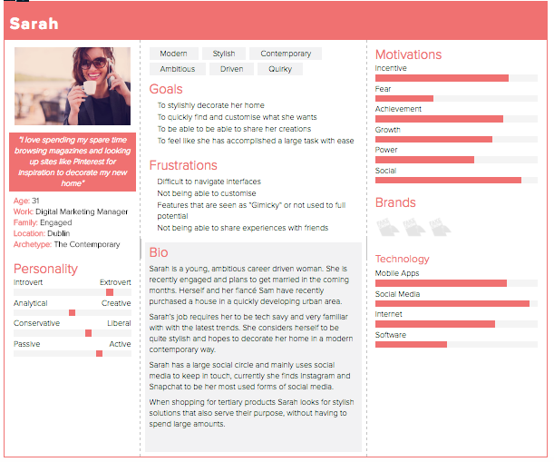
Sarah was chosen to be our primary persona because we felt that she embodied what the user research told us about who the average Ikea shopper was. Another deciding factor for choosing Sarah was the fact that working on her needs as a highly social and tech savvy person allowed for some interesting features to be developed.
Scenario.Sarah and her fiance recently bought their first home together. They have some furniture from their previous rented accommodation, and while Sarah wants to put her personal stamp on their new home; money is tight. Sarah wants to strike a balance between having a house that represents who she is, while also working within a budget. Sarah also wants the help of friends and family to realise her vision of her dream home.
Iteration 01.
The first iteration was limited, so too was our way of thinking. We designed the iteration heavily based on the existing Ikea app, using existing styles and layouts integrated with our early vision for MyKea. This version had glaring problems compared for our final product, screen and steps were missing, and the efficiency of actually using the app for its intended purpose was insufficient as the user could only place one item in the room at a time. When cross examined with Jakob Neilsons heuristics this iteration did not fair well, particularly in relation to the user control and freedom as the application was very limiting and linear in its flow.
Iteration 02.

With the second iteration we focused much more on the user and what they really needed. This is where MyKea really began to take shape. We started out by brainstorming ideas and writing down what we wanted the user to be able to do. After brainstorming we both realised that we wanted the application to have unique features that added real world value to the user. This is when we came up with the idea of using the scan of the room to also take in the prominent colours in the users room, helping suggest content which the app thinks would suit the users room.
This iteration also saw much more structure formed around the user flow of the app. The missing steps in the first iteration were amended with the addition of the scan room screen, colour palette selection and a much more thought out item browse. The second iteration could be seen as a complete overhaul of the first iteration.
If you would like to find out more about my work or would like to work on a project together, then please reach out.
I am currently looking for interesting, rewarding roles in UI/UX and Product Design.